Building a premium Yahoo Mail Plus experience
Collaborators
Design lead
Product Manager
UXR
Engineering
Timeline
Winter 2023 (3 months)
Launched in May 2023 across iOS, Android and Desktop
Role
Product Designer
Yahoo Mail Plus is our premium subscription email service that provides an ad-free email experience, premium customization, security features and more.
After a user subscribes to Yahoo Mail Plus, they only see a toast that confirms their subscription. The UI of the user’s inbox does not significantly change after becoming a YM+ user. In addition, many users subscribe to YM+ because of the ad-free email, but do not know of the other valuable benefits that are offered.
There is an opportunity here to improve the experience by making it more celebratory and educational for the user, while also increasing user retainment.
A screenshot of the old YM+ confirmation toast
How might we…
provide a premium experience for Yahoo Mail Plus users?
Since a conducting new UXR study wasn’t in the scope of the project timeline, I relied on past research regarding what users expected out of a premium experience. Findings showed that users wanted to feel like a valued consumer, and that their needs and preferences are met.
Based on this insight, my approach was to design an enhanced post-subscription modal to welcome new users to YM+.
Exploring a premium look and feel
Three different options for the new YM+ popup: simple, educational, and immersive
I explored a few different variations of what the modal could look like, with the main three being:
Simple / a popup with a congratulatory illustration and some copy would be a simple way to welcome the user into the YM+ experience
Educational / an engaging card carousel that provides an opportunity to educate the user on other YM+ benefits
Immersive / a full-screen carousel brings the user into a captivating onboarding experience that is welcoming, educational, and luxurious
Iterating with feedback from the team
Snapshot of my Figma workspace with feedback comments
Feedback from multiple crit sessions revealed:
a simple bottom sheet might not be enough to engage the user, since they would be able to easily swipe away
implementing a carousel would require more design and engineering resources at the cost of the user still quickly swiping out of the experience
a full-screen experience would block the user from accessing their inbox
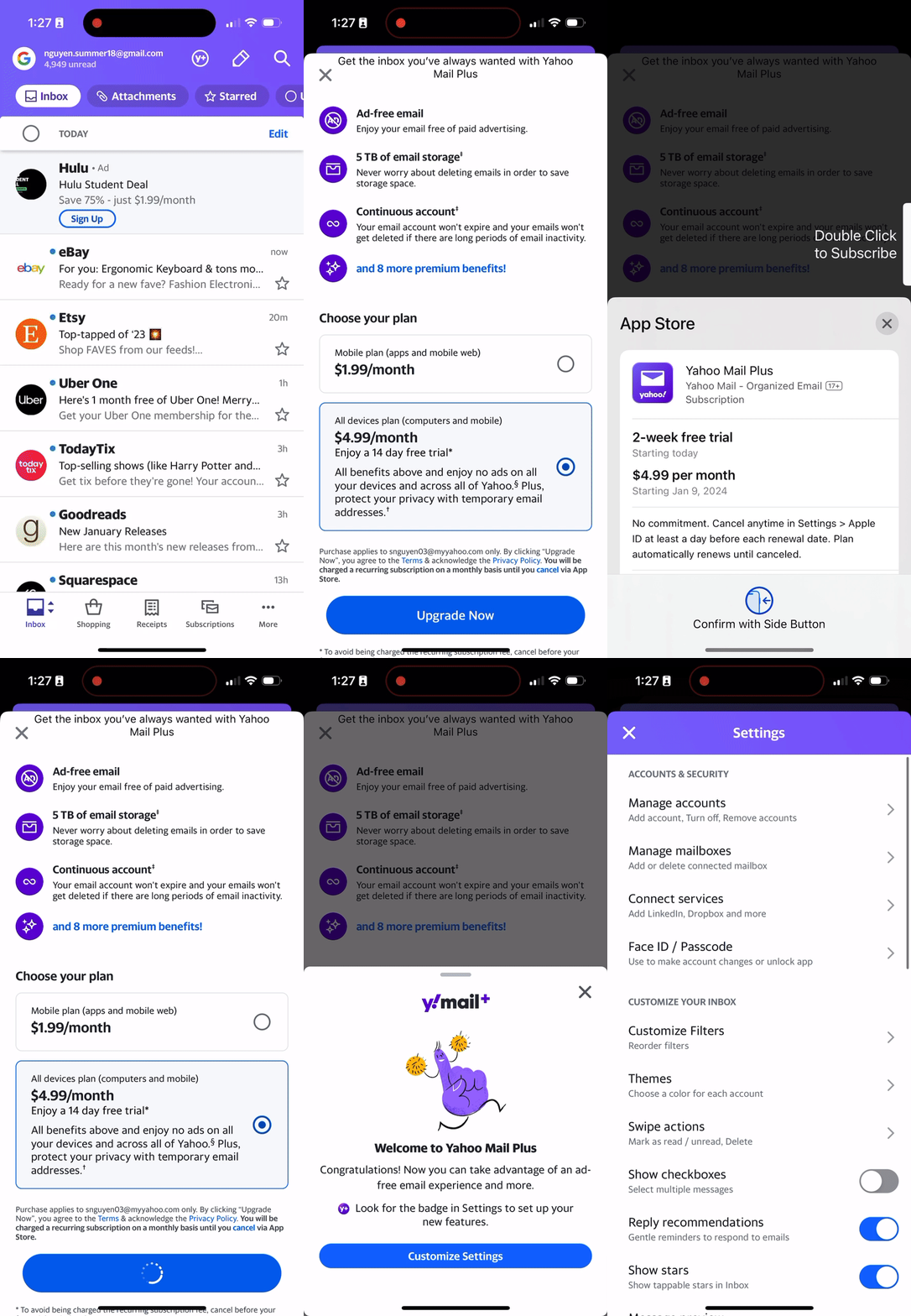
Ultimately, I settled upon an actionable welcome modal that would direct the user to their settings page to customize their new YM+ features. This would be non-blocking, congratulatory, and would provide an entry point for users to immediately access their benefits, which the old toast notification did not do.
Refining designs and building flows
The user flow of the new Yahoo Mail Plus modal
Launched to all new Yahoo Mail Plus users in May 2023
Bucket tests on iOS and Android did not show a negative impact on churn rate, indicating a neutral or positive attitude with the new modal. I moved forward with a similar experience for desktop, and the modal was GA’d to all new YM+ users across all platforms in May 2023.
Uncovering last minute technical challenges
Near completion of the designs, engineering partners posed an issue within the subscription flow on iOS. The app does not immediately recognize that the user is a YM+ user after upgrading. This means that there would be some lag between subscribing and launching the new YM+ modal, which is not a seamless experience.
To mitigate this delay, I worked with engineering to design a solution where the user would see a loading state while the app registers the user as a YM+ subscriber and thus trigger the new YM+ modal.
A loading CTA was not already in Yahoo’s design system, so I explored a few different variations before settling upon one.
Loading CTA explorations
Designing an end-to-end experience
Conceptualizing a design within a flow also means the designer must consider all stages of the flow. Doing this at the beginning of the design process would have minimized surprises during development later on!
The art of iterating
Sometimes the best idea will not present itself immediately. Multiple rounds of feedback can be such a valuable asset. Also, a simpler idea may be the best one.
File organization
Learning how to make components and name my frames properly saved me so much time. I also learned it’s also much better to organize as you go, rather than at the very end.
Reflections
Next project:
LendingTree ↗
Back to:
YMail ↩


